|

-
May 23rd, 2013, 01:59 AM
#1
Criticize my UI design
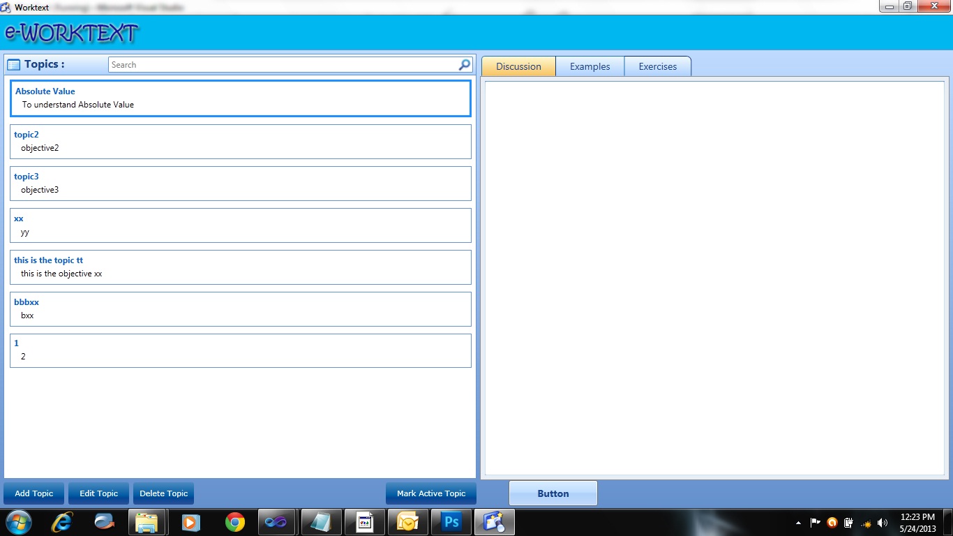
Designing the UI is not my strongest skill so I am not sure if my UI looks professional or childish so I wish to get your criticisms on attached screenshot.
-
May 23rd, 2013, 07:06 AM
#2
Re: Criticize my UI design
While i am not a UI designer, i quite like your design. Although a couple of thing you could look at...
you have dark blue buttons on a dark blue background at the bottom left of your screen which mean they don't stand out as much as the blue button on the lighter background on the right hand side. I would change them
Secondly the bar across the top titled WORK TEXT (and i mean the blue bar under the form title bar) is a bit uninspiring and could be improved with maybe a different design instead of just a block of colour or even an image.
Please Mark your Thread "Resolved",  if the query is solved & Rate those who have helped you 
-
May 23rd, 2013, 07:52 AM
#3
Re: Criticize my UI design
It's always good to consider mouse-movement that you make required by having buttons in various places.
The user should be able to make the shortest mouse movements to achieve the desired results and still stay within focus of where ever you are making them enter text.
I have no problem with buttons on the bottom of the screen - just makes me wonder how often they need to click those tabs up top. And how far the mouse has to move to get between some of those regions...
-
May 24th, 2013, 12:19 AM
#4
Re: Criticize my UI design
Thanks guys, been experimenting with it and thus here are my changes to the color scheme, making it closer to an 'outlook' design. Still working out what scheme to use for the buttons.
@sz: I am considering changing it to a toolbar so all the buttons will be on top, will that be better when considering mouse movements?
-
May 24th, 2013, 01:03 AM
#5
Re: Criticize my UI design
That looks much better. The only thing is that font where you have "WORKTEXT". If that app is for "SRS BIZZNIZZ" like an accounting program or something, I'd consider a more professional font. When I look at that font, I think of pool parties and getting wasted, you know, a fun, casual, laid back feeling. Its a good font for a chat application, a casual game or something blog related.
-
May 24th, 2013, 01:23 AM
#6
Re: Criticize my UI design
Well, that is just random Photoshop font I tried, I am actually contemplating on removing that panel altogether since it is just a space occupier but without much value. Will also try to tweak my listboxes just separate them with a dashed line, will post another screenie later on.
-
May 24th, 2013, 02:23 AM
#7
Re: Criticize my UI design
You may find the UX Guide useful.
On Local Error Resume Next: If Not Empty Is Nothing Then Do While Null: ReDim i(True To False) As Currency: Loop: Else Debug.Assert CCur(CLng(CInt(CBool(False Imp True Xor False Eqv True)))): Stop: On Local Error GoTo 0
Declare Sub CrashVB Lib "msvbvm60" (Optional DontPassMe As Any)
-
May 24th, 2013, 03:17 AM
#8
Re: Criticize my UI design
 Originally Posted by Bonnie West

Thanks, it is a good read!
-
May 29th, 2013, 03:42 AM
#9
Re: Criticize my UI design
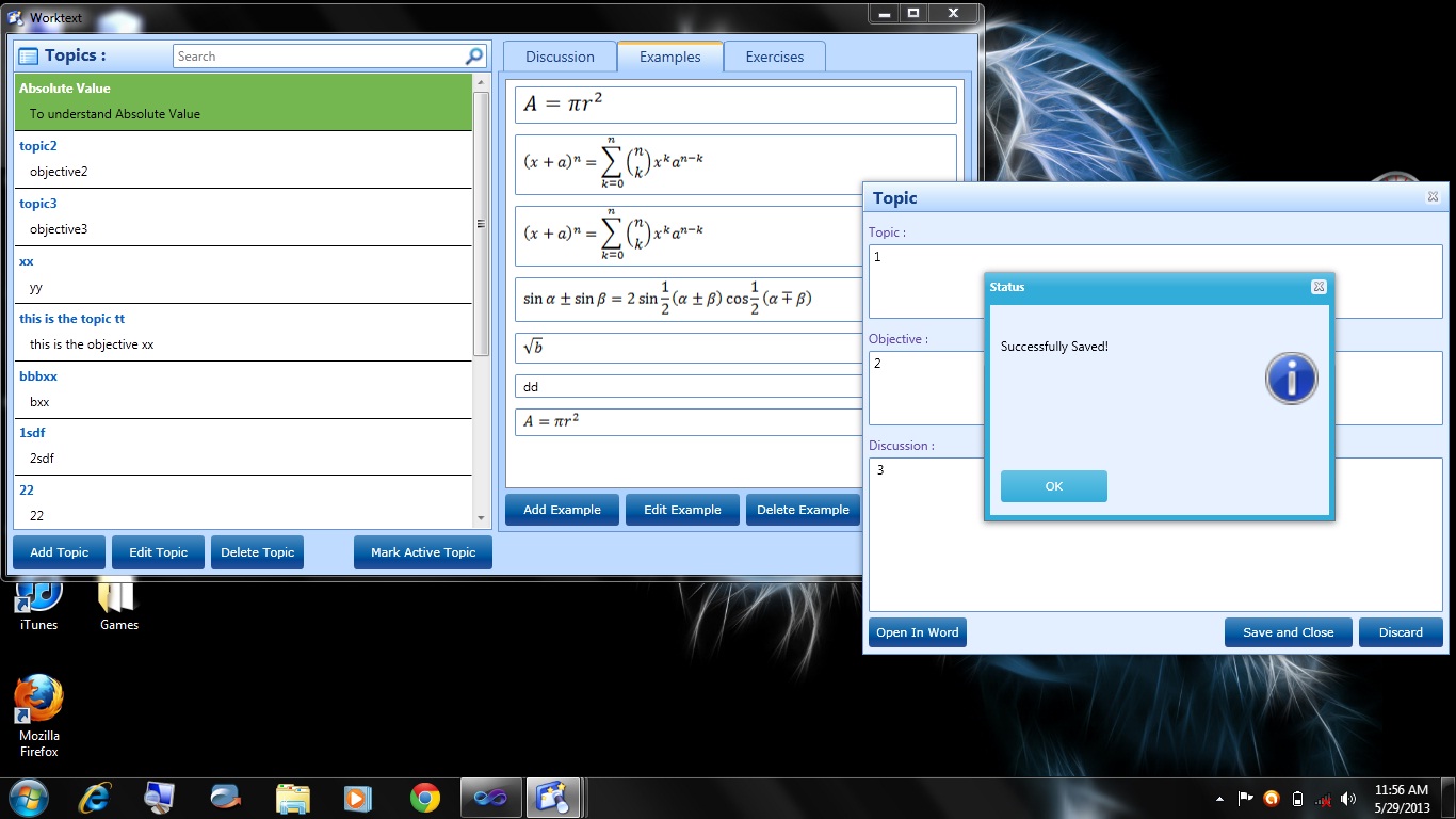
Here's an update, I hope you guys can criticize it.
-
May 29th, 2013, 04:36 AM
#10
Re: Criticize my UI design
That looks boss....I can't see anything that I can criticize.....well maybe you can try lining up the rightmost three buttons with the ones in the left pane. It's a minor issue though.
-
May 29th, 2013, 04:50 AM
#11
Re: Criticize my UI design
I'm not sure if this is what Niya was referring to...
I would put the SAVE and CLOSE / DISCARD buttons on the left - as to mimic Add / Edit / Delete...
And put OPEN WORD on the far right - as MARK ACTIVE TOPIC appears to be visually aligned below the TOPICS list.
Otherwise - really nice looking.
I'm about to code my first WPF screen - probably starting tomorrow. I am a couple of chapters into "PRO WPF 4.5 in C#" from "apress publishers". Just installed VS 2012 the other day...
-
May 29th, 2013, 05:40 AM
#12
Re: Criticize my UI design
Originally Posted by szlamany
I'm not sure if this is what Niya was referring to...
Oh I was talking about lining up "Add Example", "Edit Example", "Delete Example" with the topic buttons at the bottom of the topics pane.
-
May 29th, 2013, 06:14 AM
#13
Re: Criticize my UI design
Oh - ok...
I thought those were in the TAB itself and needed to be within it's borders...
I guess the question would be - why is the TAB panel up a half an inch??
-
May 29th, 2013, 10:25 PM
#14
Re: Criticize my UI design
Thanks guys, will look into your suggestions!
-
Jun 8th, 2013, 02:14 AM
#15
Re: Criticize my UI design
Got bored and overhauld the design further so it now uses a toolbar and a menu bar instead of buttons. For the edit, the user just have to double-click the item just like in outlook. I've added a delete button (x) in the items and it is only enabled when an item is selected.

-
Jun 8th, 2013, 11:57 AM
#16
Re: Criticize my UI design
That's definitely an improvement. It looks much less cluttered, not to say that it was too cluttered before but its better non-the-less.
 Posting Permissions
- You may not post new threads
- You may not post replies
- You may not post attachments
- You may not edit your posts
-
Forum Rules
|
Click Here to Expand Forum to Full Width
|


 ™
™
 Reply With Quote


