|

-
Jan 24th, 2022, 10:52 AM
#5041
Re: Corona virus, China major city lockdowns, etc.
Yes, trusting the people you trust, I would feel very insecure too.
-
Jan 24th, 2022, 12:16 PM
#5042
Re: Corona virus, China major city lockdowns, etc.
Did you read in the mainstream media that the study was retracted?
The mainstream media certainly published it. They were hardly going to let red meat like that pass them by.
That study does not show any of the results of the original retracted "study"
Why would it?
when it actually does and very well (mostly when combined with other proper drugs)
It doesn't. Multitudinous research projects have demonstrated that it doesn't.
Then, tell me a reason why I should keep spending time answering to you, or reading your replies
Up to you but as long as you keep posting dangerous and unsubstantiated nonsense I'll be responding to yours.
Last edited by FunkyDexter; Jan 24th, 2022 at 12:23 PM.
The best argument against democracy is a five minute conversation with the average voter - Winston Churchill
Hadoop actually sounds more like the way they greet each other in Yorkshire - Inferrd
-
Jan 24th, 2022, 12:36 PM
#5043
Re: Corona virus, China major city lockdowns, etc.
 Originally Posted by Eduardo-

Your objective: to make me waste my time.
Well, haven't we succeeded?
My usual boring signature: Nothing
 
-
Jan 24th, 2022, 12:37 PM
#5044
Re: Corona virus, China major city lockdowns, etc.
Originally Posted by Eduardo-
Then, tell me a reason why I should keep spending time answering to you, or reading your replies.
Because you can't resist.
My usual boring signature: Nothing
-
Jan 24th, 2022, 12:59 PM
#5045
Re: Corona virus, China major city lockdowns, etc.
Originally Posted by Eduardo-
At least I explained what a theory is and how science works regarding theories.
You can find that post like 5 pages behind.
Found it. It was post #4874, for anybody interested. You did explain theories quite well in that post. The only time you ventured close to peer reviewed publications was 4917, when you said that you got a bunch of information from them, but opted not to mention any of them.
That's the basic problem. You may well have some solid articles with good foundations, but all you put forward is pablum created for shallowness. You talk about having good sources, how about sharing some?
My usual boring signature: Nothing
-
Jan 24th, 2022, 01:46 PM
#5046
Re: Corona virus, China major city lockdowns, etc.
To break the boring back and forths here...
Unbelievable snow today in Athens (and I say that because Athens gets snow every 3-5 years, of course we had snow the previous season but we didn't have for 10 year before). I saw cars stuck in the middle of city main roads.
Attika road the most modern highway road in Attika was closed and passengers are stuck in their cars for 8 hours now!
Born of an insect repellent politicians couldn't help their friend the main contractor of the road and there would possibly be big fines. I say "possibly" because this is Greece.
I went to Lykabetous hill and it was like a big snowy mountain. Tomorrow public and private sector is on hold. Of course there is no chance for anyone to move. I live in the center of Athens and the roads where stuck with cars not able to move. There is a phenomenon, I don't know how to translate it but it's heavy snowfall with thunder and lightning. I haven't seen that again.
ἄνδρα μοι ἔννεπε, μοῦσα, πολύτροπον, ὃς μάλα πολλὰ
πλάγχθη, ἐπεὶ Τροίης ἱερὸν πτολίεθρον ἔπερσεν·
-
Jan 24th, 2022, 02:48 PM
#5047
Re: Corona virus, China major city lockdowns, etc.
Originally Posted by Eduardo-
So, as I said, I have vast experience on this area of discussing with people that just want to believe the official information, to adhere to mainstream at all costs, that want to follow the mass.
I believe I know why people do this. It took me a while to figure it out but I believe it has something to do with people's self-worth. So many people marry their identity to their beliefs, so much so that if they were to let go of their beliefs in light of evidence that counters said beliefs, it makes them feel robbed of their self-worth.
Lets use a contrived example. Let's say you have a person. Lets call this person Tom. Tom is a member of a cult. He is a very diligent and loyal member that believes wholeheartedly in what this cult and it's leaders stand for. As a reward for his faith, his leaders decide to promote him to a high rank within the membership. In addition they also announce to the congregation that he is the chosen one of God. Tom loves this. Tom feels special in a way he has never felt in his life before.
Now another guy comes along. Perhaps he is Tom's childhood friend. Let's call him Adam. Adam sits down with Tom and presents reasoned arguments as to why this cult is nothing more than a bunch of hocus pocus nonsense. Adam even presents evidence that the cult leaders are not who they claim to be. Perhaps they are swindling money from the membership while having orgies with their wives and daughters in lavish hotel suites. Now any reasonable person would expect Tom to be disgusted and perhaps even denounce the cult. This is not what would happen. Tom would fight tooth and nail against Adam about why Adam is wrong. Tom would never be able to accept the truth because all of Tom's self-worth is tied up with this cult. Remember, he is the chosen one of God. If he accepts that this cult made all of it up then being the chosen one has no meaning. He would no longer be special. He'd just be another sad victim who was preyed upon by smarter men. Being the chosen one of God is a lot better for Tom's ego than being the victim of a cult so it makes sense he would not want to let go of his beliefs. He cannot ever accept the latter because it would crush his soul and he knows it. He fears the day he has to face the truth so he does everything in his power to never see that day come.
This is some powerful stuff here and it took me a lifetime to understand that this is what lies at the core of every person that resists truth and common sense. It also takes many forms. It doesn't have to always be a religion or a cult. It could be a person like a head of state(Eg. Hitler) or your best friend(Eg. That friend that everyone says is bad but you swear he is just misunderstood). It could also be a core set of beliefs like the leftist woke propaganda promoted by the mainstream media. Whatever form it takes, the psychology is the same.
-
Jan 24th, 2022, 02:49 PM
#5048
Re: Corona virus, China major city lockdowns, etc.
Are you going to troll if I open a new thread? (or have some decency?)
-
Jan 24th, 2022, 02:56 PM
#5049
Re: Corona virus, China major city lockdowns, etc.
thanks Eduardo
the first video we can read here:
https://hatchardreport.com/relations...use-mortality/
second video quite good data.
so, 17.000 died in UK of Covid. and the average age is 82.5
and the doctor say its above the average age of death, so its not strange that people dies at that age.
he says that, because of the lockdowns, the result was many people didnt get help when they needed.
now we tried to safe a old persons life, while a woman in her 40 with breast cancer didnt get help soon enough.
is it worth it? no.
third video:
the interesting data: total death in UK for 2020 and 2021 (3/4) that dies "of" covid:
he is more detailed about it, but the conclusion is the same as the above 17.371 and average 82.5. the official data show 7.9x more death, making it look a lot more than it is.
average life expectancy 2018-2020: 79 males, 82.9 females
now, excess death from cancer
he show data from Professor Karol Sikora, believe it caused 50.000 extra death over the past 18 month.
this because of late treatments or checkups.
right now 6 million people waiting for NHS,
-
Jan 24th, 2022, 04:00 PM
#5050
Re: Corona virus, China major city lockdowns, etc.
Originally Posted by Niya
I believe I know why people do this. It took me a while to figure it out but I believe it has something to do with people's self-worth. So many people marry their identity to their beliefs, so much so that if they were to let go of their beliefs in light of evidence that counters said beliefs, it makes them feel robbed of their self-worth.
So far, yes, may be.
I'm not psychologist (as I said somewhere else), so I don't understand their mental process.
What I can say is that:
They are insecure.
They are not able to reason, they can "believe" at the same time contradictory information with "no problem".
They are very narrowed in their thinking.
They are not interested in evidence.
They are not interested in changing any point of view.
They trust in someone else, they don't want to have the responsibility of seeing something by their own intellectual capacities.
They think the people that they trust on are better than the mortal one they have "in front" (sometimes they say things like "who are you" or "what do you think you are").
They attack the messenger to silence the message.
They are fanatic.
But more than that, IDK how some people can reach those mental states.
Lets also note that most of people that follow "mainstream" (for example catholic) don't go so much way down. They just won't discuss, they are not interested in discussing anything. They have no idea in what they believe but they don't care.
Originally Posted by Niya
Lets use a contrived example. Let's say you have a person. Lets call this person Tom. Tom is a member of a cult. He is a very diligent and loyal member that believes wholeheartedly in what this cult and it's leaders stand for. As a reward for his faith, his leaders decide to promote him to a high rank within the membership. In addition they also announce to the congregation that he is the chosen one of God. Tom loves this. Tom feels special in a way he has never felt in his life before.
May be. I think remember from the video about mass formation that one thing is they have "a cause", something to fight for.
Originally Posted by Niya
Now another guy comes along. Perhaps he is Tom's childhood friend. Let's call him Adam. Adam sits down with Tom and presents reasoned arguments as to why this cult is nothing more than a bunch of hocus pocus nonsense. Adam even presents evidence that the cult leaders are not who they claim to be. Perhaps they are swindling money from the membership while having orgies with their wives and daughters in lavish hotel suites. Now any reasonable person would expect Tom to be disgusted and perhaps even denounce the cult. This is not what would happen.
Sometimes it does. I think Roman Catholic lost many people for this reason in later decades.
Also, for your example, it is true when the information presented by Adam is true. Most Adams will throw a lot of prejudices more than actual information or facts.
Some atheist are more or the same fanatic and closed-minded than this other people we are talking about. So if Adam is one like that, he will say anything to the poor Tom.
Originally Posted by Niya
Tom would fight tooth and nail against Adam about why Adam is wrong. Tom would never be able to accept the truth because all of Tom's self-worth is tied up with this cult. Remember, he is the chosen one of God. If he accepts that this cult made all of it up then being the chosen one has no meaning. He would no longer be special. He'd just be another sad victim who was preyed upon by smarter men. Being the chosen one of God is a lot better for Tom's ego than being the victim of a cult so it makes sense he would not want to let go of his beliefs. He cannot ever accept the latter because it would crush his soul and he knows it. He fears the day he has to face the truth so he does everything in his power to never see that day come.
These people are obviously more interested in being in a group with other people than knowing what is truth and what is not, and more important in that case: having a real relationship with the true God. In short: they are more interested in society than in God.
Originally Posted by Niya
This is some powerful stuff here and it took me a lifetime to understand that this is what lies at the core of every person that resists truth and common sense. It also takes many forms. It doesn't have to always be a religion or a cult.
They all behave in the same way. What I saw in that forum (and in other places that I saw people like that) is the same that I see in political fanaticism, in veganism, in atheism... and now with this pandemic and what I'm seeing in this thread it seems that a new cult has emerged.
It has its followers and guardians of the faith.
Originally Posted by Niya
It could be a person like a head of state(Eg. Hitler) or your best friend(Eg. That friend that everyone says is bad but you swear he is just misunderstood). It could also be a core set of beliefs like the leftist woke propaganda promoted by the mainstream media. Whatever form it takes, the psychology is the same.
I have a case of a friend that became quite fanatic in later times about political views. Some decades ago we were close friends and we still appreciate each other.
We (me and other guys in the group) don't know why he made this turn.
His views turned something like communist, but mostly he is anti-American (anti-USA).
For him all the problems of the world is because of Americans.
He also brings that to local politics and there is where most of the discussion with the group happen.
He supports a government and political party that are all criminals, but their narrative is kind of anti-American, or more precisely anti-IMF.
I tried to explain that Americans, some are good and some are bad as in anywhere else. That in the world there is bad people everywhere, that about countries, Americans are not the only bad ones (that they are the less bad). That other are worse (China, Russia, Iran, etc).
BTW, now with this war that is happening, because I call it a war already, I'm thinking that there are many Americans in it, but this is international, they are not just Americans (Klaus Schwab is not American for example).
Yes, this is WW3. Not from country to country but from the richest against everybody else.
-
Jan 24th, 2022, 04:04 PM
#5051
Re: Corona virus, China major city lockdowns, etc.
-
Jan 24th, 2022, 04:19 PM
#5052
Re: Corona virus, China major city lockdowns, etc.
Originally Posted by baka
thanks Eduardo
the first video we can read here:
https://hatchardreport.com/relations...use-mortality/
second video quite good data.
so, 17.000 died in UK of Covid. and the average age is 82.5
and the doctor say its above the average age of death, so its not strange that people dies at that age.
he says that, because of the lockdowns, the result was many people didnt get help when they needed.
now we tried to safe a old persons life, while a woman in her 40 with breast cancer didnt get help soon enough.
is it worth it? no.
third video:
the interesting data: total death in UK for 2020 and 2021 (3/4) that dies "of" covid:
he is more detailed about it, but the conclusion is the same as the above 17.371 and average 82.5. the official data show 7.9x more death, making it look a lot more than it is.
average life expectancy 2018-2020: 79 males, 82.9 females
now, excess death from cancer
he show data from Professor Karol Sikora, believe it caused 50.000 extra death over the past 18 month.
this because of late treatments or checkups.
right now 6 million people waiting for NHS,
Baka, you know how many people died of Influenza and Pneumonia in 2018 and 2019 in UK?:
2018: 29,516
2019: 26,398
https://www.ons.gov.uk/aboutus/trans...0182019and2020
Also, how many died of cancer in UK in 2019 and 2020 (for comparison):
2019: 147,419
2020: 147,407
Source: https://www.ons.gov.uk/aboutus/trans...kin2019and2020
This page gives similar numbers, bit a bit higher: https://www.cancerresearchuk.org/hea...y#heading-Zero
And how many died of covid alone in 2020: 9,400
The numbers don't support the narrative.
His YT channel seem to have some interesting videos, but I didn't have time to watch others: https://www.youtube.com/c/academyofideas/videos
His uncensored web sites has even more (also I only took just a look):
https://americandigest.org/
https://academyofideas.com/
(Anyone would have hard times finding those with Google searches -unless perhaps being very specific and with an exact match)
-
Jan 24th, 2022, 04:25 PM
#5053
Re: Corona virus, China major city lockdowns, etc.
Originally Posted by sapator
To break the boring back and forths here...
Unbelievable snow today in Athens (and I say that because Athens gets snow every 3-5 years, of course we had snow the previous season but we didn't have for 10 year before). I saw cars stuck in the middle of city main roads.
Attika road the most modern highway road in Attika was closed and passengers are stuck in their cars for 8 hours now!
Born of an insect repellent politicians couldn't help their friend the main contractor of the road and there would possibly be big fines. I say "possibly" because this is Greece.
I went to Lykabetous hill and it was like a big snowy mountain. Tomorrow public and private sector is on hold. Of course there is no chance for anyone to move. I live in the center of Athens and the roads where stuck with cars not able to move. There is a phenomenon, I don't know how to translate it but it's heavy snowfall with thunder and lightning. I haven't seen that again.
Sounds like Seattle: Any snow and the city comes to a halt.
We get snow every year, it just tends not to stick around for very long. I didn't even know we HAD plows until we had a LOT of snow a couple years back. Then I found out we had plows. Most were broken, but we had plows. What we didn't have is people who knew how to plow. I watched some guy trying to plow a parking lot. It was clear he had no plan, as he was just pushing the snow one way, then another, then back the first way. It seemed like he didn't quite know where to put it and kept changing his mind...or hoping that the friction of pushing it around would cause it to melt.
My usual boring signature: Nothing
-
Jan 24th, 2022, 04:27 PM
#5054
Re: Corona virus, China major city lockdowns, etc.
Originally Posted by Niya
Lets use a contrived example. Let's say you have a person. Lets call this person Tom. Tom is a member of a cult. He is a very diligent and loyal member that believes wholeheartedly in what this cult and it's leaders stand for. As a reward for his faith, his leaders decide to promote him to a high rank within the membership. In addition they also announce to the congregation that he is the chosen one of God. Tom loves this. Tom feels special in a way he has never felt in his life before.
Better watch out. I know who you are talking about, and that church does have a tendency to go after people. With great futility, but they are persistent.
My usual boring signature: Nothing
-
Jan 24th, 2022, 04:35 PM
#5055
Re: Corona virus, China major city lockdowns, etc.
Also I have pointed to read these books:
Joost Meerloo: The Rape of the Mind.
Arthur Versluis: The New Inquisitions Heretic-Hunting and the Intellectual Origins of Modern Totalitarianism.
-
Jan 24th, 2022, 04:37 PM
#5056
Re: Corona virus, China major city lockdowns, etc.
FunkyDexter and Shaggy Hiker will be ignored by me in this thread.
-
Jan 24th, 2022, 04:41 PM
#5057
Re: Corona virus, China major city lockdowns, etc.
Originally Posted by Eduardo-
So, you cite good sources for the first two...then a youtube channel for the last one. How about we look at total deaths in the England and Wales (I don't know why they leave Scotland out, but whatever).
2017: 533,253
2018: 541,589
2019:530,841
2020:607,922
Note that the death rate went up be less than 2% from 2017 to 2018, then went down by about the same amount from 2018 to 2019, but then went up by over 14% from 2019 to 2020, the first partial year of COVID. The same report puts the COVID deaths at 73,766, which is less than the unusually high increase in total deaths.
You might also note that I used the same ons source for those total and COVID deaths that you used for the other kinds of deaths. A bit hard to understand how you would use that as a source for the other deaths, but then ignore it when it came to COVID and turn to Youtube instead. If you don't like what they say about COVID, why did you like what they said about the flu and cancer?
My usual boring signature: Nothing
-
Jan 24th, 2022, 04:53 PM
#5058
Re: Corona virus, China major city lockdowns, etc.
This is the last one, just for courtesy (please don't answer anymore because I won't read): it can have a simple explanation: many people died because of the lack of treatment of their diseases due to lockdowns.
IDK if that alone can account for the whole difference, but is is for sure a factor.
I would like to see the number is suicides too.
Unfortunately in your case Shaggy, you sometimes raise valid arguments, but unfortunately I can't read you anymore because of the large amount of other not valuable posts you also make.
You might also note that I used the same ons source for those total and COVID deaths that you used for the other kinds of deaths. A bit hard to understand how you would use that as a source for the other deaths, but then ignore it when it came to COVID and turn to Youtube instead.
Actually, I found that official page from the YT video. The covid numbers provided in the video comes from there (but you don't care to watch, that's why you didn't know).
-
Jan 24th, 2022, 05:06 PM
#5059
Re: Corona virus, China major city lockdowns, etc.
https://www.bitchute.com/video/hXIhfcxDROJq/
Eduardo, its the mass formation.
we can not do anything about those 30%, need to focus on the 40%
-
Jan 24th, 2022, 05:42 PM
#5060
Re: Corona virus, China major city lockdowns, etc.
Originally Posted by Shaggy Hiker
Because you can't resist.
You were right. He couldn't resist. He keeps saying he's going to stop wasting his time. I'm starting to not believe him. lol
-
Jan 24th, 2022, 05:52 PM
#5061
Re: Corona virus, China major city lockdowns, etc.
Originally Posted by Eduardo-
Actually, I found that official page from the YT video. The covid numbers provided in the video comes from there (but you don't care to watch, that's why you didn't know).
If they came from there, then they misstated them, because I posted the actual link, so you can see for yourself that the numbers they reported were flat out wrong.
My usual boring signature: Nothing
-
Jan 24th, 2022, 05:54 PM
#5062
Re: Corona virus, China major city lockdowns, etc.
Originally Posted by baka
Originally Posted by baka
Both videos are good (and short) Baka, thanks.
I found another one that I tried to find before but failed:
Web page of that video (I presume it is from the same guy of the other web sites I posted before): https://covid19up.org/
Lot of things to study, but I have to do other things now.
-
Jan 24th, 2022, 06:27 PM
#5063
Re: Corona virus, China major city lockdowns, etc.
One important thing to understand is the difference between valid and true.
-
Jan 24th, 2022, 06:29 PM
#5064
Re: Corona virus, China major city lockdowns, etc.
Originally Posted by Shaggy Hiker
Better watch out. I know who you are talking about, and that church does have a tendency to go after people. With great futility, but they are persistent.
Hmmm...I wasn't really thinking of a particular church. I was thinking of multiple cults like Jim Jones' cult, NXIVM and some mainstream religions like Catholicism. I was also thinking of how similar they are to the American mainstream left leaning ideology that convinces people to believe in nonsense like toxic masculinity and more than 2 genders. Trying to convince members in any of these groups that some of their beliefs are unfounded in anything factual is like pulling teeth. My post explained what I believe this is so.
-
Jan 24th, 2022, 06:47 PM
#5065
Re: Corona virus, China major city lockdowns, etc.
yeah. quite good explanation of whats going on.
good illustrations and easy enough to understand and make connections.
not sure the 30% will understand at all, but maybe the 40% will.
-
Jan 25th, 2022, 04:03 AM
#5066
Re: Corona virus, China major city lockdowns, etc.
this is interesting:
https://rumble.com/vt62y6-covid-19-a...d-opinion.html
Discussion begins around 40 minute mark. Sen. Ron Johnson moderates a panel discussion, COVID-19: A Second Opinion. A group of world renowned doctors and medical experts provide a different perspective on the global pandemic response, the current state of knowledge of early and hospital treatment, vaccine efficacy and safety, what went right, what went wrong, what should be done now, and what needs to be addressed long term.
More at www.ronjohnson.senate.gov
one subject is ivermectin:
A study of 160,000 patients, with a group that took Ivermectin prophylactically and one that did not.
Results: Ivermectin completely shattered in terms of positive results on Covid-19.
and, for all the 30%'s do not watch. it will just irritate you. so avoid.
Last edited by baka; Jan 25th, 2022 at 04:23 AM.
-
Jan 25th, 2022, 04:21 AM
#5067
Re: Corona virus, China major city lockdowns, etc.
Tom is a member of a cult.
What you're talking about is well known and it's used in everything from indoctrination to simple sales techniques. The thing is to identify whether Tom or Adam is in the cult. I'll give you a clue, if you're the one defining the majority (i.e. the mainstream) as the cult, then you're actually the one in the cult.
The best argument against democracy is a five minute conversation with the average voter - Winston Churchill
Hadoop actually sounds more like the way they greet each other in Yorkshire - Inferrd
-
Jan 25th, 2022, 04:23 AM
#5068
Re: Corona virus, China major city lockdowns, etc.
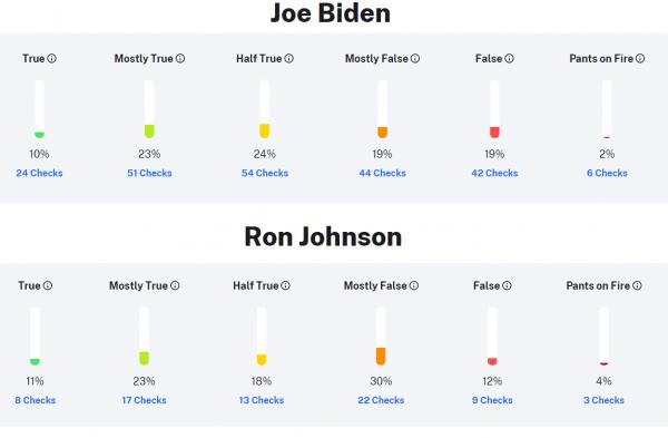
Senator Ron Johnson Fact Checked
He's well known for spreading Covid disinformation because it appeals to his political base.
The best argument against democracy is a five minute conversation with the average voter - Winston Churchill
Hadoop actually sounds more like the way they greet each other in Yorkshire - Inferrd
-
Jan 25th, 2022, 04:34 AM
#5069
Re: Corona virus, China major city lockdowns, etc.
now, for all of us that understand, we would do this:
- life of politicians.
- the left wing will attack right wing
- the right wing will attack left wing
this will create the mistrust in all politicians no matter wing, no matter if they are evil or good.
more, a moderator is just a moderator. we understands that.
the 30% fails. but we understand that as well.
for the 70%, just ignore the attacks from the 30%. since they are not objective at all. they are scared and emotional.
just look at the video Eduardo posted, mass formation. its exactly that.
so, for all of you that are courageous, watch the video, its interesting and important. do not let those negative and egoistical persons win.
and how can u even trust a person that:
- completely avoid the video, he knows NOTHING about the meeting. NOTHING.
- what he do, is try to find something to discredit the video.
- he knows 0 of the content. its laughable.
a sane person would watch. I have 0 problems watching a video of Biden or Fauci. contrary. I want to watch and see what they say. to make my own judgement.
more I know about this people, easier is to make conclusions.
so I post it again:
this is interesting:
https://rumble.com/vt62y6-covid-19-a...d-opinion.html
Discussion begins around 40 minute mark. Sen. Ron Johnson moderates a panel discussion, COVID-19: A Second Opinion. A group of world renowned doctors and medical experts provide a different perspective on the global pandemic response, the current state of knowledge of early and hospital treatment, vaccine efficacy and safety, what went right, what went wrong, what should be done now, and what needs to be addressed long term.
More at www.ronjohnson.senate.gov
one subject is ivermectin:
A study of 160,000 patients, with a group that took Ivermectin prophylactically and one that did not.
Results: Ivermectin completely shattered in terms of positive results on Covid-19.
and, for all the 30%'s do not watch. it will just irritate you. so avoid.
Last edited by baka; Jan 25th, 2022 at 04:50 AM.
-
Jan 25th, 2022, 04:53 AM
#5070
Re: Corona virus, China major city lockdowns, etc.
The best argument against democracy is a five minute conversation with the average voter - Winston Churchill
Hadoop actually sounds more like the way they greet each other in Yorkshire - Inferrd
-
Jan 25th, 2022, 06:35 AM
#5071
Re: Corona virus, China major city lockdowns, etc.
I don't know how to translate it but it's heavy snowfall with thunder and lightning.
‘snownado’
https://www.washingtonpost.com/weath...-thunder-snow/
Please remember next time...elections matter!
-
Jan 25th, 2022, 06:38 AM
#5072
Re: Corona virus, China major city lockdowns, etc.
Originally Posted by baka
this is interesting:
https://rumble.com/vt62y6-covid-19-a...d-opinion.html
Discussion begins around 40 minute mark. Sen. Ron Johnson moderates a panel discussion, COVID-19: A Second Opinion. A group of world renowned doctors and medical experts provide a different perspective on the global pandemic response, the current state of knowledge of early and hospital treatment, vaccine efficacy and safety, what went right, what went wrong, what should be done now, and what needs to be addressed long term.
More at www.ronjohnson.senate.gov
one subject is ivermectin:
A study of 160,000 patients, with a group that took Ivermectin prophylactically and one that did not.
Results: Ivermectin completely shattered in terms of positive results on Covid-19.
and, for all the 30%'s do not watch. it will just irritate you. so avoid.
You picked a real moron with that one...
https://www.nbc26.com/news/local-new...octors-respond
Please remember next time...elections matter!
-
Jan 25th, 2022, 08:42 AM
#5073
Re: Corona virus, China major city lockdowns, etc.
Last edited by baka; Jan 25th, 2022 at 09:08 AM.
-
Jan 25th, 2022, 08:52 AM
#5074
Re: Corona virus, China major city lockdowns, etc.
Originally Posted by baka
https://www.wkow.com/coronavirus/sen...c49311ff6.html
MADISON (WKOW) -- Senator Ron Johnson moderated a panel discussion Monday featuring doctors and nurses making claims about the COVID-19 pandemic and vaccine that have been rejected by a majority of the medical community.
Wisconsin doctors and hospitals said some of the claims made during the five-hour forum at the Russell Senate Office Building in Washington, D.C. were outright untrue.
Please remember next time...elections matter!
-
Jan 25th, 2022, 08:56 AM
#5075
Re: Corona virus, China major city lockdowns, etc.
-
Jan 25th, 2022, 10:12 AM
#5076
Re: Corona virus, China major city lockdowns, etc.
So just to be clear, Tyson posts a debunking of that conference and your immediate response is to reupload that conference. You realise that it's garbage, right? You are willingly seeking out the snake oil salesman who continue to sell you the snake oil.
The best argument against democracy is a five minute conversation with the average voter - Winston Churchill
Hadoop actually sounds more like the way they greet each other in Yorkshire - Inferrd
-
Jan 25th, 2022, 10:17 AM
#5077
Re: Corona virus, China major city lockdowns, etc.
I need 45 minutes more before Im done with the video. will post more soon.
-
Jan 25th, 2022, 11:26 AM
#5078
Re: Corona virus, China major city lockdowns, etc.
done.
what can I say?
a lot I already know, since I follow a few of the doctors.
but there was also new people, especially nurses, victims, lawyers and others, many that lost their job in a inhuman way.
its 5 hours long, so its a lot. but worth it.
highly recommended. https://rumble.com/vt62y6-covid-19-a...d-opinion.html
-
Jan 25th, 2022, 12:10 PM
#5079
Re: Corona virus, China major city lockdowns, etc.
Originally Posted by TysonLPrice
Well if they say so. But it's not close to the Greek usage.
I would just say snowstorm or snowthunderstorm, that seems closer even if used differently in English.
On that note. I went the usual excursion to Lykabetous hill today. Everyone happy, making snowmen and shooting snow balls. What I didn't see and I must have seen over 1000 people as I where up there for close to 5 hours, was a mask. I did not see a ssssingle mask. You will of course say negligence, I would say Good over evil.Mehh, tomato, tomahto.
ἄνδρα μοι ἔννεπε, μοῦσα, πολύτροπον, ὃς μάλα πολλὰ
πλάγχθη, ἐπεὶ Τροίης ἱερὸν πτολίεθρον ἔπερσεν·
-
Jan 25th, 2022, 01:32 PM
#5080
Re: Corona virus, China major city lockdowns, etc.
Aaaand, another Chart from Uttar Pradesh 
(where Omicron was hitting now as well, the wave beginning about 3 weeks ago)...

So, this is how the "dangerous Omicron-Variant" affects a highly populated (sub)country,
where only about 20% of the population are vaccinated.
The rest of the population only received "alternative drugs" -
(these BTW provided "in special packages" by the WHO ...
"as an exception, don't talk about it - especially not what was in there")
And just in case you're wondering about the "last black line snippet in the chart"...
well, that's not the x-Axis ... nope,... it's the "curve" for the current deaths.
Hmm, guess that this study (scientists in Israel published) was right in,
that "natural immunity works a whole lot better" (when you give it a chance, that is...  ) )
There certainly shouldn't be any complaints about the "sample-size" here either -
(in Uttar Pradesh live about 240Mio people).
Olaf
 Posting Permissions
- You may not post new threads
- You may not post replies
- You may not post attachments
- You may not edit your posts
-
Forum Rules
|
Click Here to Expand Forum to Full Width
|


