


Hi all,
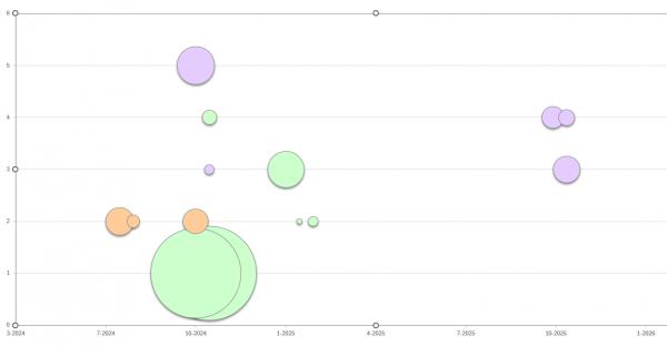
I have this Bubble Chart in Excel using the data from columns B (Y-values), C (X-values) and D (bubble size) in a single series. The different bubble colors represent the different people and not the series.
Everything looks OK the way I want it to except that I can't seem to format the X-axis labels to show the quarter values (data in column D) instead of the date in "m-yyyy" as it is now (which is the closest I could get as the quarters)
I hope someone can help me with some ideas to achieve my goal.
Thanks for reading!
Stanav.

 Reply With Quote